aut spain
LOGO DESIGN + BRAND STRATEGY + BRAND IDENTITY DESIGN + STYLE GUIDES
CREDITS: BRAND STRATEGY (MISION, VISION AND PURSPOSE), STORYTELLING, BRAND IDENTITY AND STYLE GUIDES BY LA LUQUERIA.
story
AUT is a company in the health and fitness sector. Not only does it offer training in disciplines such as calisthenics, functional training and animal flow but also workshops on nutrition, health and new training methodologies.
Another strength of the brand is that it offers a calendar of sports challenges such as surfing, climbing or snowboarding to its community. All of them related to outdoor physical activity, of course.
solution
The brand was expanding notably and they wanted to convert it into franchises. Therefore, it was fundamental to reinforce the communication and branding with a clear communication strategy.
After analyzing the business model and its values with the brand’s founder and CEO Rubén Hurtado we elaborated a new communication strategy. It included storytelling, the development of the brand’s mission, vision and purpose and the design of an entire new brand identity.
result
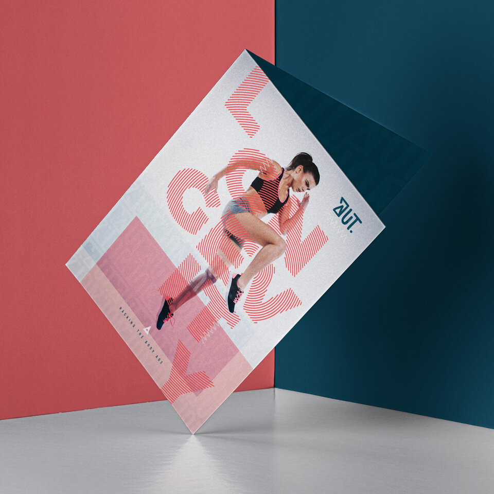
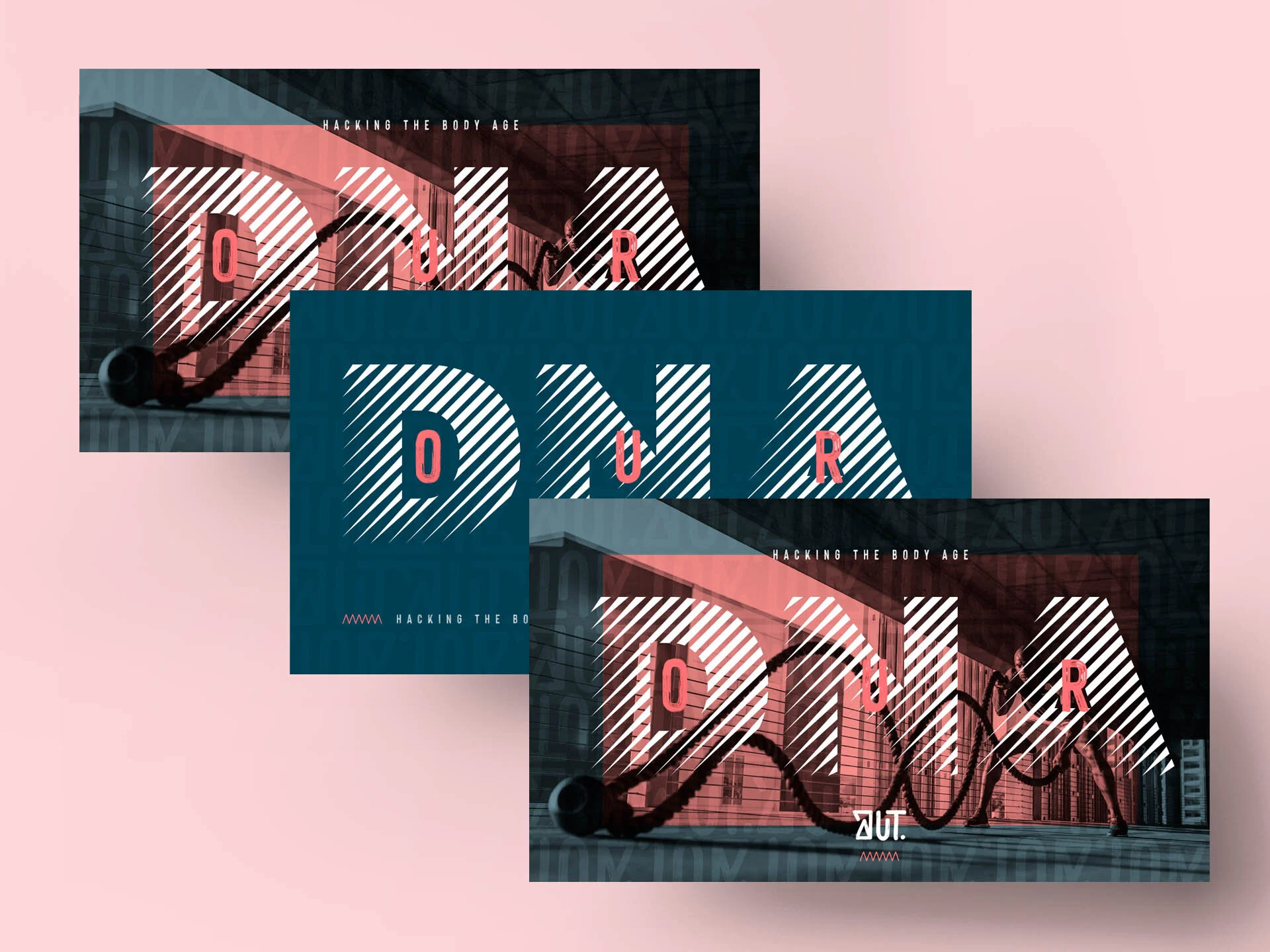
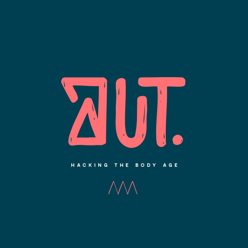
Definition of the brand claim as ‘Hacking the body age’ having drawn upon the Japanese concepts of ‘Ikigai’ and ‘Moai’. Japan is one of the places in the world where life expectancy is higher than average.
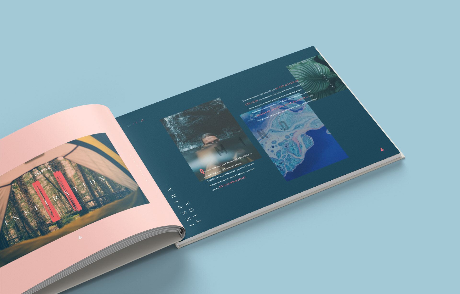
In order to represent this we designed the branding with an artisan style (with its imperfect forms of nature) adapted to our contemporary times. This was reflected in the brand book and the brand identity together with the new guidelines and applications of the brand for merchandising and social media.

storytelling: the brand book

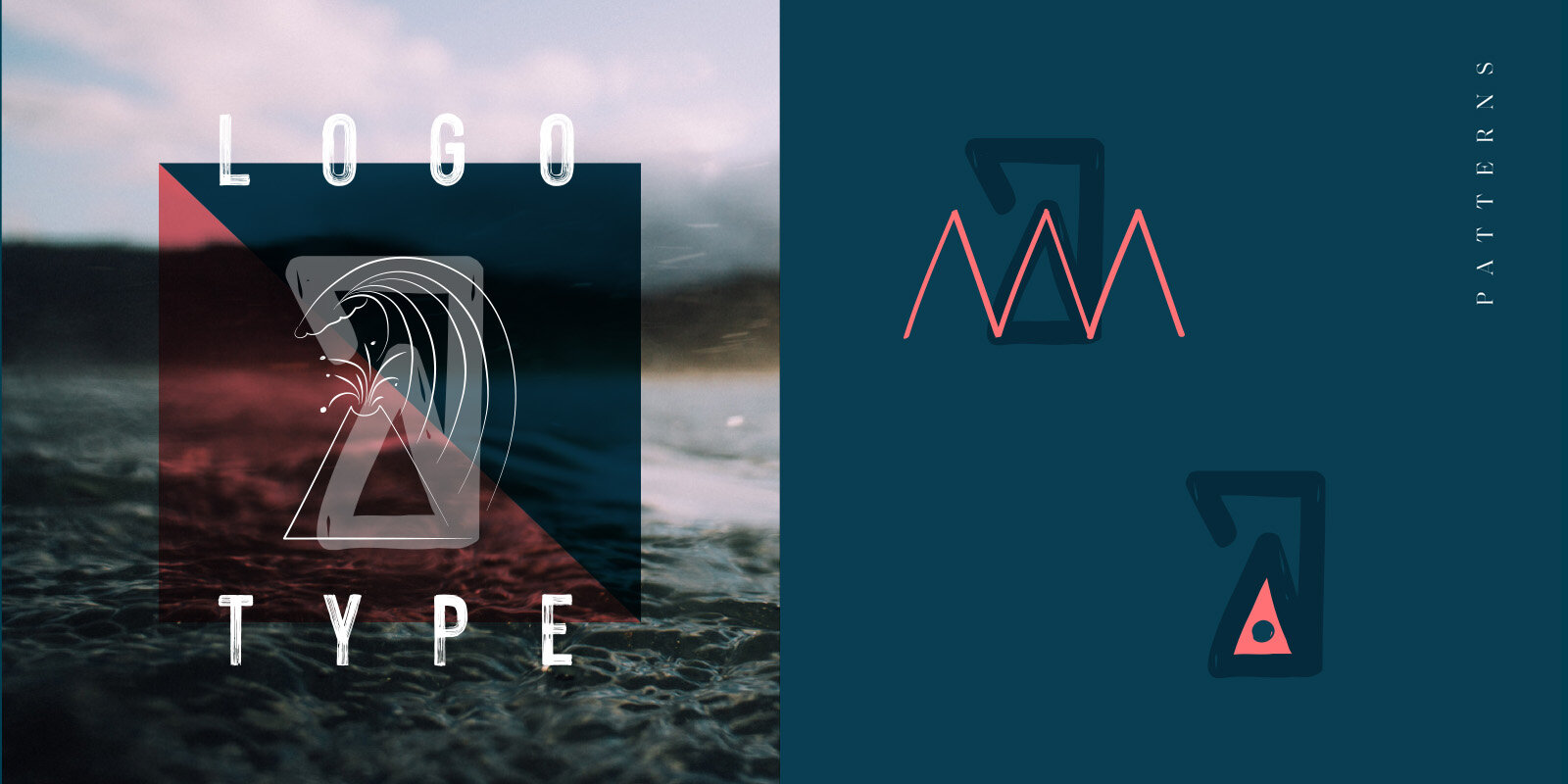
visual concept & logotype
style guides